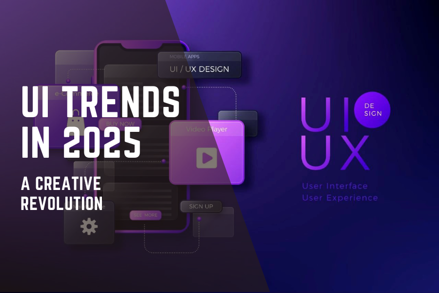
Aesthetics aren’t enough for design in 2025–it’s become more about emotion. UI (User Interface) design transforms into a fascinating intersection of technology, art, and emotion. Let’s look into some of the best UI trends in 2025, with examples from the real world, actionable information, and predictions for what’s next in design.
1. Colors: Bold, Bright, and Evocative
Color in UI Trends 2025, is all about storytelling. Rather than finding a “pretty” set of colors and using that for UI design, brands are now adopting color palettes that tell you how you should feel.
For example:
- Deep hues of blue and purple inform feelings of trust and mystery (tech brands like Samsung).
- Brilliant red and orange hues draw excitement (as seen in the new dynamic Netflix UI splash).
- Natural hues of green and brown inform feelings of sustainability (as seen in some branded efforts from Patagonia).
Additionally, color-shifting interfaces are becoming more popular. Applications that use settings to change the backdrop color according to the time of day or your mood.
2. Dynamic, Fluid Typography: Living Text
In UI Trends 2025, typography moves, breathes, and acts. Fonts stretch, melt, bounce, and flow– they react to the user’s interaction.
Evaluate sites like Figma and Pitch. The text elements behave like living things, and each scroll feels like an exploding performance. This kind of typography interests users for much longer than typical set-and-forget typography. It’s playful, unexpected, and richer in emotional content.
Consider a fitness app where the font gets bolder depending on the user’s achievement of training goals. Some brands are creating “liquid” typefaces that change gradually depending on the situation.
3. AI-Powered Graphics and Generative Films: A Novel Creative Collaborator
AI is now working with you to design, not just aiding you with emails or suggestions. By 2025, AI tools such as Adobe Firefly, Runway ML, and Canvas Magic Design will help designers produce layouts, graphics, and even videos in seconds!
Picture saying to an AI: “Make me a futuristic website banner with a night sky and glowing planets,” and it kicks out five different quality versions for you to choose from. Brands such as Nike and Coca-Cola have added AI-generated videos to their toolbox, to provide stunning ad campaigns quickly. In short, AI is not replacing designers. It gives designers a new powerful brush to paint bigger, faster, and smarter.
4. 3D and Immersive Interfaces: More Than Flat
While the flat style had its heyday, 3D is suddenly gaining popularity–and not because it requires users to wear complex virtual reality goggles. Designers may produce lightweight 3D objects for websites and applications using programs like Spline and Blender.
For example, Shopify’s new updated “Home” page has updated the homepage to add some subtle 3D objects that tilt while you move your mouse around. Even personal portfolios, like Bruno Simon’s 3D site, provide users with a feeling like they are driving through a digital world.
3D creates a depth within interfaces, adds memorability, and allows for an experience, rather than simple information.
5. High Contrast: Crisp, Bold and Clear
Accessibility is a big deal in 2025, and one easy but effective way to improve accessibility is through high-contrasts. Black and white, deep blues with neon yellows, purples with greens – contrast is simply not only beautiful but practical.
Apple’s recent advertising pages are a great example – sharp text against clean backgrounds makes it easy to read, easy to understand, and easy to navigate, even for those who have a visual limitation.
High makes a huge difference in catching people’s attention. Not only does it define your design clearly, but it gives a no-hassle way to distinguish your design from others without getting cluttered.
6. Dark Mode + Neon Colors: Electric Dream
Dark mode is still cool, but in 2025, it’s evolving – with neon colors.
Think black backgrounds illuminated with electric blues, pinks, and greens. This mix has already been used by apps like Discord and console gaming interfaces like Xbox to create an edgy, futuristic, and fashionable vibe.
In addition to being visually pleasing, neon in the dark reduces eye strain, which makes it more pleasant for extended periods of Web browsing or gaming.
7. Motion Posters: Motion is In
Even posters will be moving by 2025. Digital posters will be completely mini-movies once they are static and simply have a basic animation for movement.
Television spots and print ads, motion posters are worth less than they once were, but brands like Netflix, Spotify, and The New York Times have seized movement posters to grab our attention in less than a blink of an eye. Imagine a Spotify ad where the album cover pulses to the beat of a song or a movie poster where the hero’s cape flutters in the background without overpowering the title.
Is there anything more effective than motion to make static designs come to life in an attention-starved environment where many see only the first few seconds?
In Conclusion,
In 2025, movement, emotion, and meaning will be at the core of UI design. AI is making design incredibly clever, quick, and flexible. Typography is dynamic. High contrast, vivid colors, motion posters, 3D hints, and neon dark modes illuminate everything. And as a result, all brands are growing more thoughtful and sustainable.
Instead of merely impressing people, the future of UI will engage them, draw them in, and give them an experience they won’t soon forget.
Are you ready to design the future? It’s already here – and it is glorious.